A design system from scratch

Context and goal
NLMK’s design system 1.0 was Material UI with a new coat of paint. The goal was to move to an in-house design system 2.0 built for complex manufacturing interfaces and MES
Team and role
Two engineers, the head of the design department and me. I owned the design, the design system architecture, design leadership and resources
Naming, versioning and documentation were worked out together with the engineers
Approach
I started with research: trips to the plants to meet the people who use these interfaces every day, requests from designers, and a review of the Sber, Yandex and Ozon design systems. The outcome was an 11-stage plan
System
We ended up with two design systems running side by side. The internal one covers foundations, product components, patterns, icons and guides, and evolves with NLMK’s internal systems. The open one is open source; more on it below
Tokens
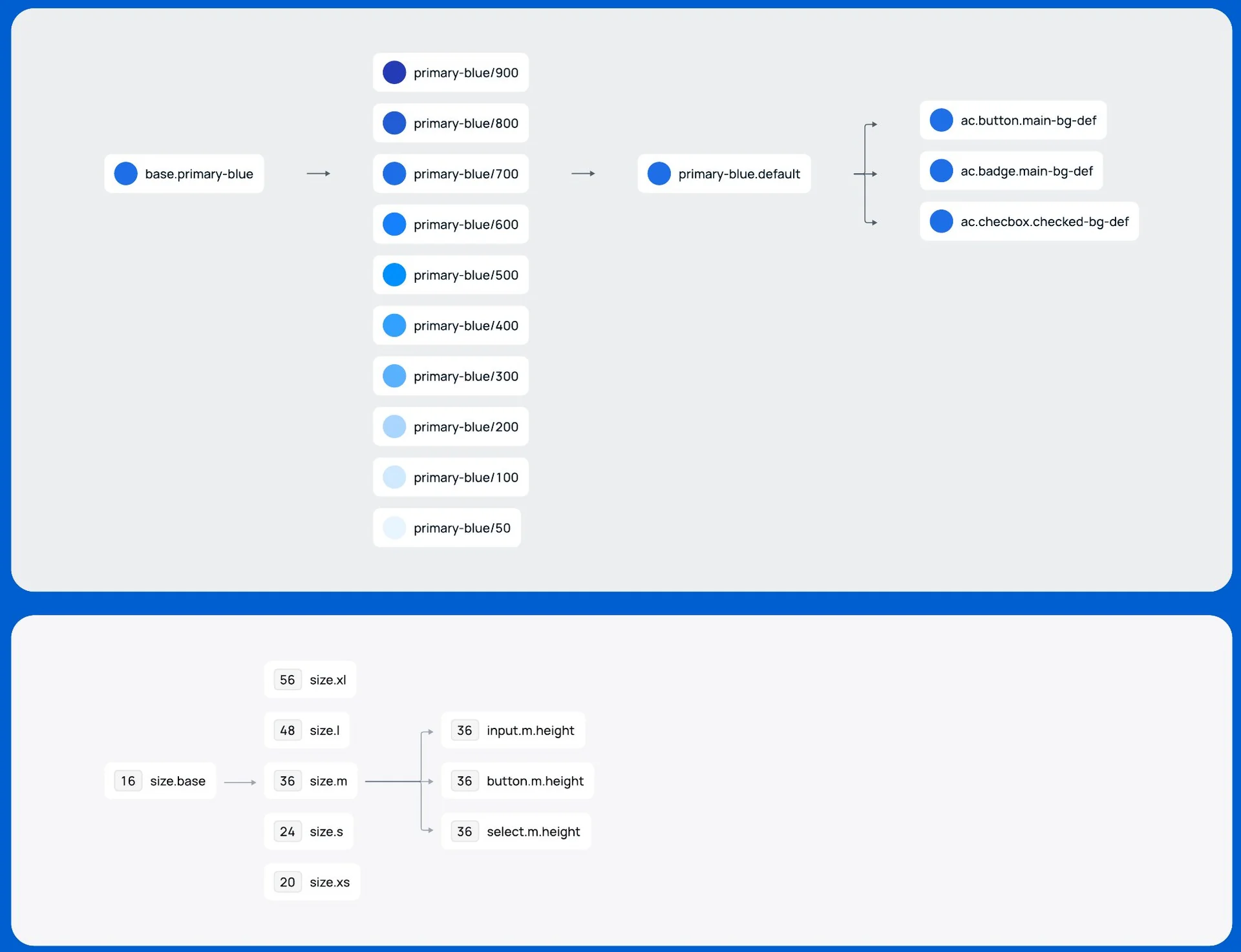
The key decision: tokens live on the design side, component variants on the frontend side. Tokens were built in Tokens Studio, because Figma had no native tokens back then. There are four tiers: base color → palette from 50 to 900 → semantic token → component token. For example, base.primary-blue → primary-blue/700 → primary-blue.default → ac.button.main-bg-def. Sizes work the same way: size.base 16 → size.m 36 → input.m.height. Tokens are stored as JSON in the repository, each with a description
Components
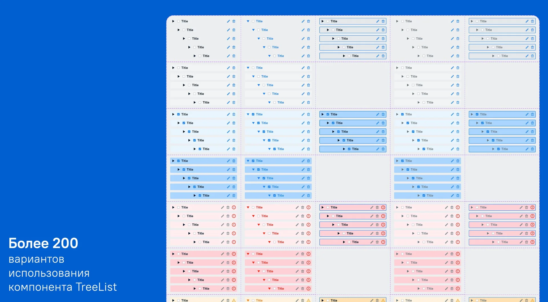
46 core components in design and 40 in code. Complex components are assembled from states and variants: TreeList alone has more than 200
Versioning and updates
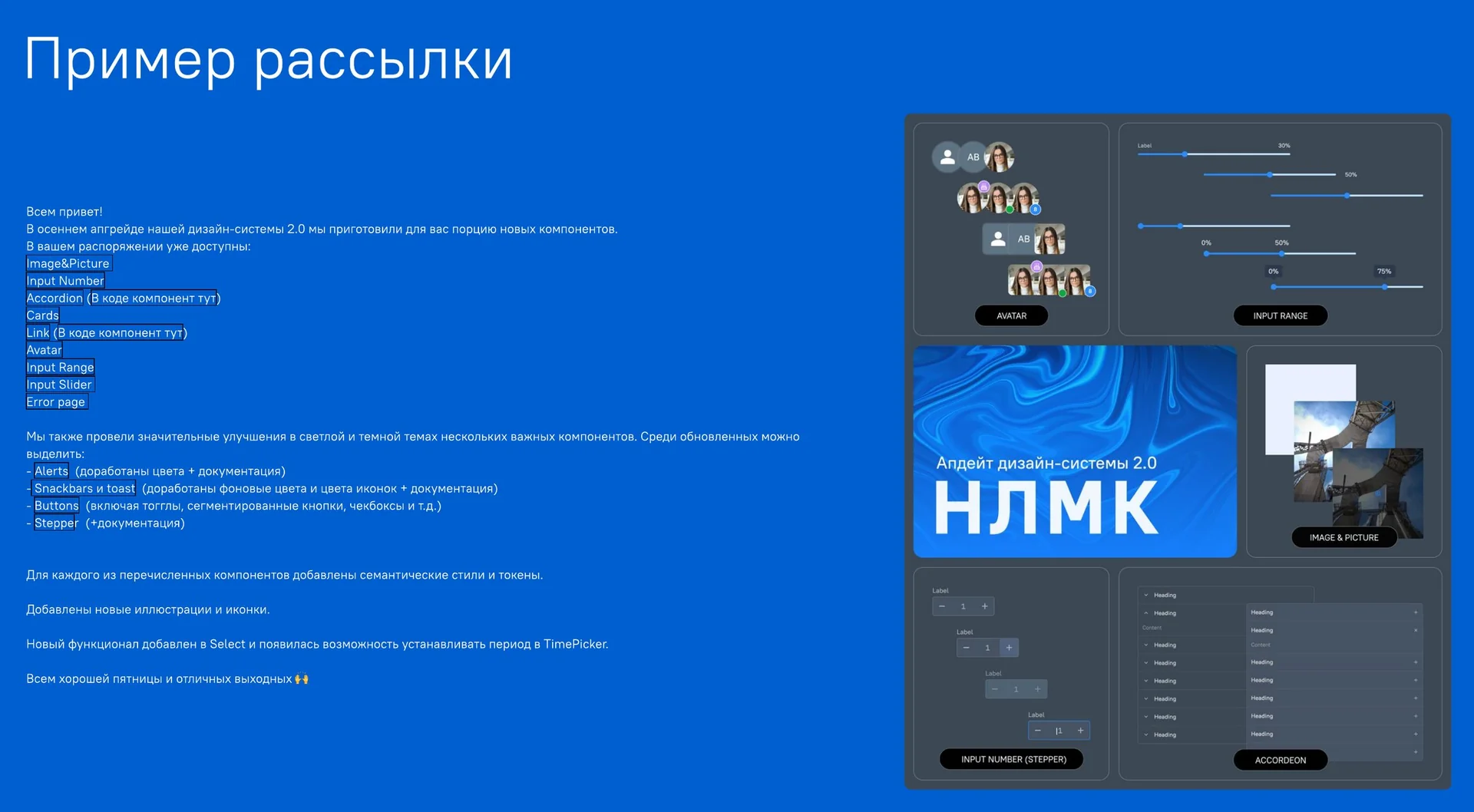
One version number for design and code, plus a separate suffix for each side: v02.11.98.des34 and v02.11.98.fe67. Teams hear about updates through a newsletter: new components, fixes, links to code and docs
Open-source part
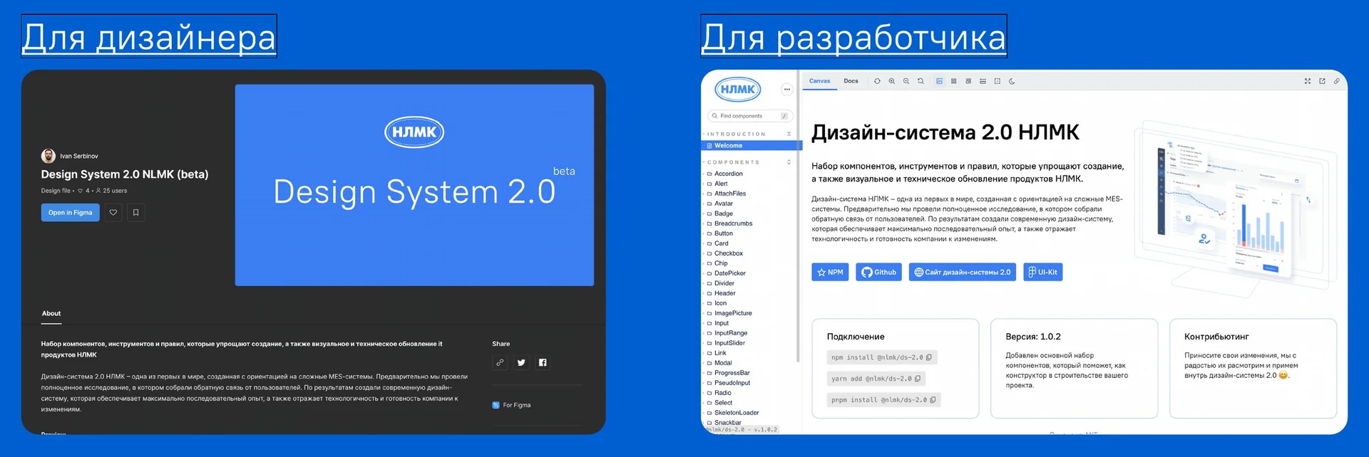
The open design system is for designers and engineers outside NLMK: the ds.nlmk.com landing page, a Figma UI kit, Storybook, the @nlmk/ds-2.0 package on npm, a GitHub repository, MIT license. It includes the logo, a palette generated from a brand HEX code, PT Root UI typography, icons, a modular grid, light and dark themes
Figma UI kit ↗Storybook ↗npm ↗GitHub ↗
Result
- Savings from adoption: about $1M a year, internal estimate
- Design system satisfaction index: 8.1
- Two design systems: internal and open
- A component showcase in Figma
- The package outlived my time there: 280+ versions on npm, the latest in 2026
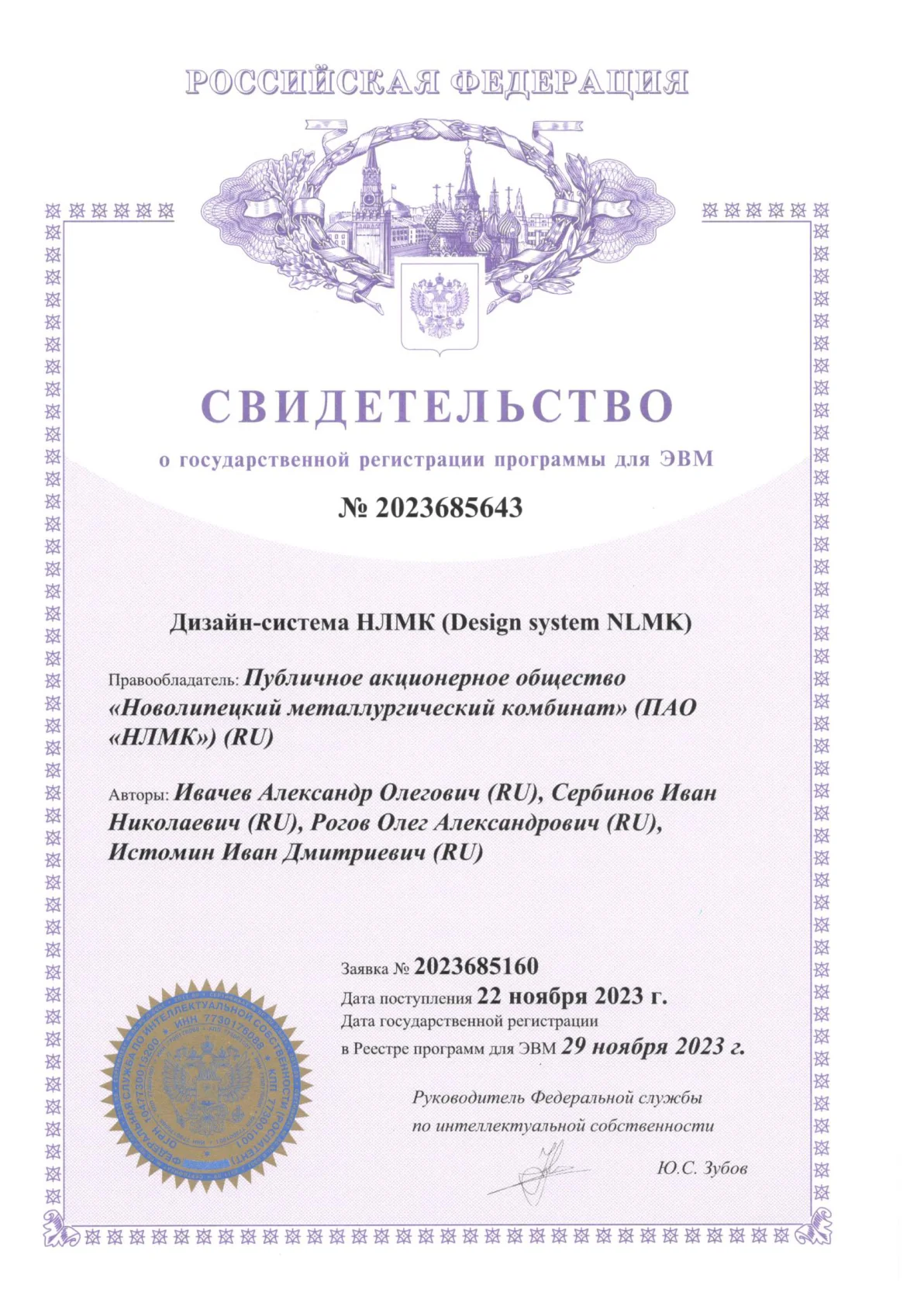
- State software registration certificate No. 2023685643, “NLMK Design System”, dated November 29, 2023. Rights holder: NLMK PJSC; authors: two engineers, the head of the design department and me