A platform and a design team for a school that grew tenfold in a year

Context
Tetrika is an online school with its own teaching platform, pure B2C. The school built the platform in-house: student and tutor accounts, schedule, homework, library, payments
I joined as Design Team Lead. Within a year the company grew 900% and the design team went from two people to eight. I worked closely with the CEO and CTO
Problem
The company was growing 900% a year, and the design team started with two people. Three things had to scale at once
- The platform: student and tutor accounts on any screen
- Marketing: dozens of landing pages and visual assets
- The team itself: hiring and growing people without losing quality
Approach
Strategy and process first, screens second. Together with the CEO and CTO I set up the design strategy, the roadmap, hiring and the path from design to engineering. Tasks were prioritized by data
- Research and CJM: the customer journey from first touch to regular lessons, including an email communication map
- A/B tests
- Design system: kit, groundwork for the codebase, guides
Research
Interviews
We began by talking to the people who live in the platform every day: tutors and students. Answers were sorted onto separate boards for each role. A few things tutors told us
- Once homework is sent, you can’t see it again, so you have to ask the student for a link
- Intro lesson materials need to be sorted by level, grade and goal, with a separate set for adults
- Picking materials inside the platform is convenient, but they want small topic blocks, not whole lessons
And from a parent
- Homework arrives as photos in a chat and nobody minds: no need to change anything
- Progress tracking and ratings in the account are just extra noise for parents
- It would be nice to save the lesson whiteboard to check notes later
- Cancelling a lesson by picking a reason or “contact me” works fine
Customer journey map
A Customer Journey Map in Miro for two personas: a student’s parent and the student. The journey is split into nine stages. For each one the map lists customer actions, touchpoints and notifications, the experience, solutions and growth points, feedback, and screenshots
- Unaware
- Searching and choosing a school
- First visit
- Intro lesson
- Purchase
- Getting started
- Using the product
- Retention
- Churn and feedback
The map showed where the school was losing customers: between booking the intro lesson, buying and the first classes. That is where the top platform and marketing priorities went
Growth hypotheses
In the “Solutions, growth points” row every idea is written as a hypothesis: “if we do this, we get that”. Each comes with questions to check in interviews. Here are some of them
- Acquisition
A referral program for students and tutors will bring more customers, more motivated tutors and lower recruiting costs
- Acquisition
Getting into the top ten of search and paid results will bring plenty of free traffic
- Acquisition
Targeting ads at parents only will improve traffic quality
- Choosing a school
Up-to-date school info and a promo code in ratings will make us look better to customers and lift conversion
- Choosing a school
Asking loyal customers for reviews on specific platforms, with tutor and student reviews kept separate, will raise our rating
- Intro lesson
Offering a date and time right in the intro lesson sign-up will raise booking conversion
The map was also wired to short in-product surveys: “How did you hear about us?”, a smiley or star rating of the site, how easy the sign-up form was. A negative answer opens a comment field, a positive one suggests sharing on social media
System
Platform
I started with a product map: which parts it is made of
- Logger
- New account
- Mobile account
- Content feed
- Packages split by subject
- Subscription model
- Cart
- Corporate website
- Curriculum builder
Student and tutor accounts were designed as one system of screens rather than a set of pages. The screens were made by the team under my lead. In Figma every screen has versions for 1920, 768 and 320 px and separate states. The student account covers goals, schedule, homework, library, payments and a “Bring a friend” referral block
Design system
I built and ran the design system: a Figma UI kit for the account components, groundwork for the codebase, and guides. Every team used it
Brand
The rebrand and brand book were done by contractors. I was on the client side: reviewing and accepting their work and keeping in touch with them
Landing page structure
For the main landing page and subject pages I mapped how programs and subject pages connect. Mini-groups were left out of the first version of the site
Marketing in one system
About 40 landing pages a year and over 100 visual pieces and videos, including social media templates. All of it was made by the team under my lead
Experiment
One lead form asked for an email first and a phone number second. I swapped the fields and ran an A/B test. Leads went up 35%
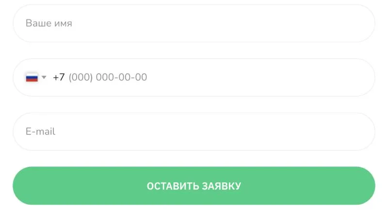
This is one of many A/B tests I can walk you through; their results are still live in production
Result
- An in-house online learning platform for students and tutors
- A new brand book and a design system used by every team
- The design team grew from 2 to 8 while the company grew 900%
- Almost every junior reached mid-level within a year, then moved on to promotions at other companies