One token system for three design systems

Context
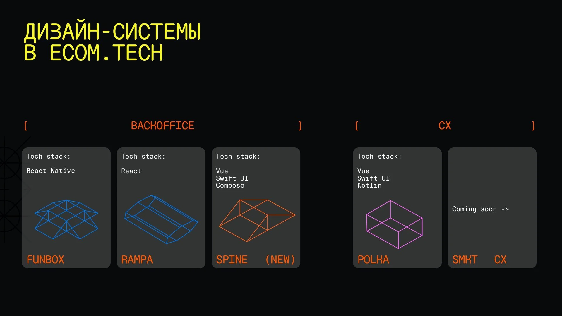
ecom.tech builds the tech behind Samokat and Megamarket. Inside the company there are 70+ back-office products for staff, warehouses and sellers. And “back office” is broader than it sounds: the apps serve everyone from couriers and warehouse workers to people operating delivery drones
I led the back-office design systems. Each had its own stack and its own teams. I worked hand in hand with the Director of Product Design
Problem
Three independent design systems meant four kinds of pain: UX and UI drifted apart between products, decisions weren’t aligned, support was expensive, and moving between systems was hard for teams
- Mockups full of old components nobody maintained anymore
- Components hacked together on the fly, with no tokens and no review
- Some components existed in design but not in code
- No shared way of organizing Figma files
Approach
Don’t merge three systems into one: give them a shared foundation instead. Tokens became the common language between design and engineering, and between the design systems themselves. Components stay in their own stacks but are described by the same tokens
- Designers understand the constraints of code: tokens, performance
- Engineers join design discussions early and can assemble a working interface without a designer
- Cross-functional workshops and shared processes for design and engineering
- Legacy decisions are made together with engineering
System
Color semantics
A token name is built from six parts. Only the category and the property are required; the rest is added when needed
--colorcategory-notificationspecialization-backgroundproperty-brandrole-strongvariant-hoverstate
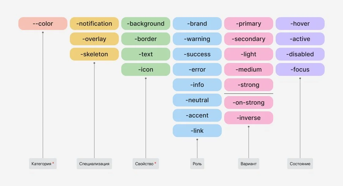
Put together, the parts give tokens like --color-background-brand-strong-hover or --color-text-on-strong. Specialization handles exceptions: for example, in the dark theme a notification’s background is darker than other components’
Sizes, spacing, radii, typography
Themes
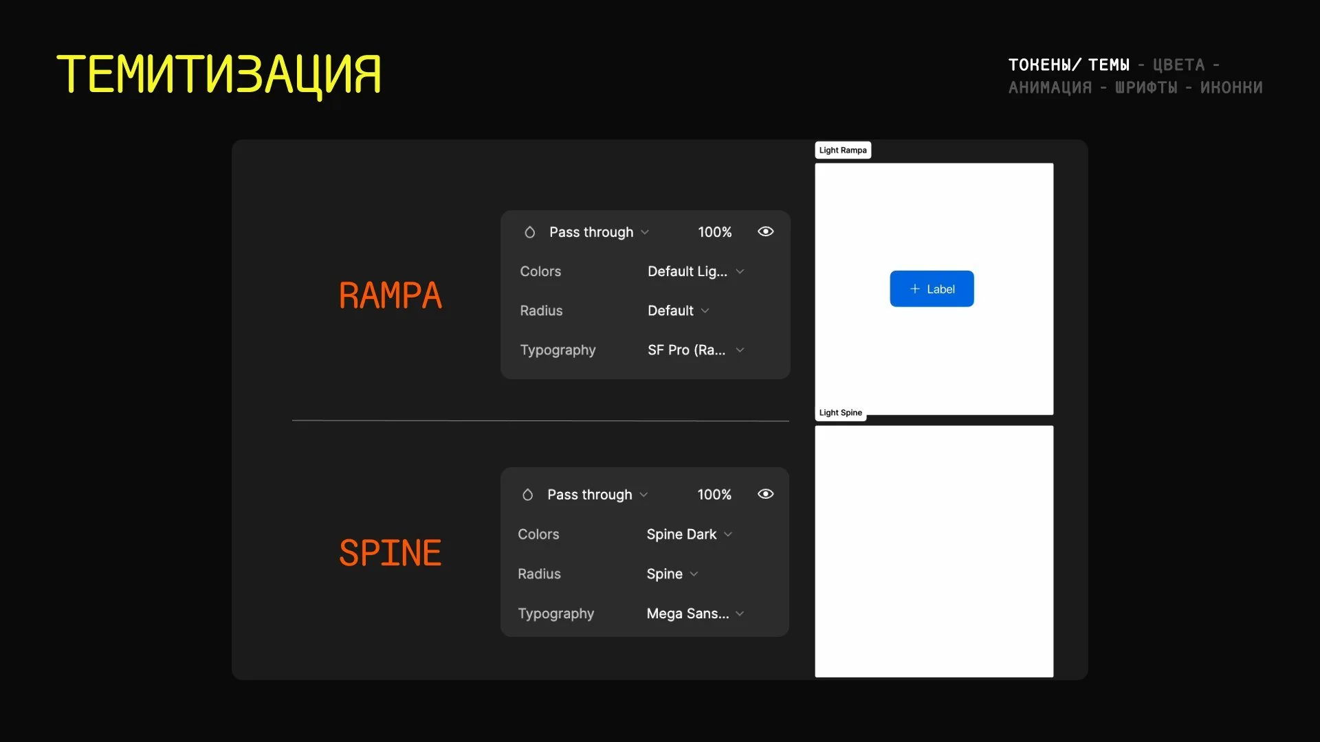
We rebuilt the tokens to support multiple themes and gave all themes their own page in Storybook. The tokens came with documentation for everyone on the teams
Motion
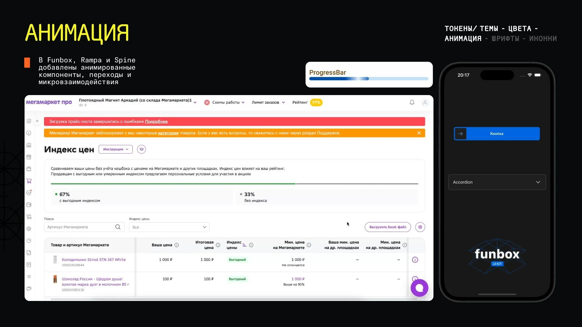
Until summer 2024 the design systems had no motion at all. We introduced easing and duration tokens and described when to use which. Animated components, transitions and micro-interactions followed in Funbox, Rampa and Spine
Processes
- UX review of components and a self-check list for product designers
- Accessibility (a11y): component audit, guidelines, contrast
- How-tos for change requests and bug reports
- Release digest, icon guidelines
- Component usage analytics
- Two-week sprints: one component per sprint
Design systems
- 100 components
- 45 products
- Complex tables and theming
- Replaced 46 legacy components with our own
- 8 projects
- 90% of bug reports closed the same day
- 41 web components and 29 mobile
- Moved to the shared token system
- Tokens adopted by most merchant teams
Result
- 70+ products on three design systems with a shared token foundation
- Features ship 40% faster: an internal audit compared before and after on tasks of similar size and complexity
- NPS went up for all three design systems over the year
One foundation, many products
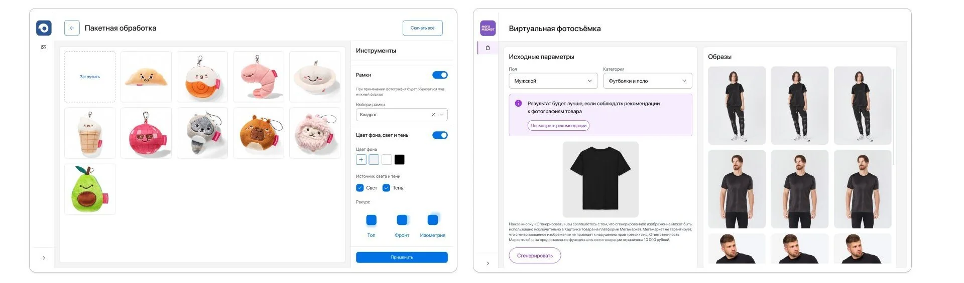
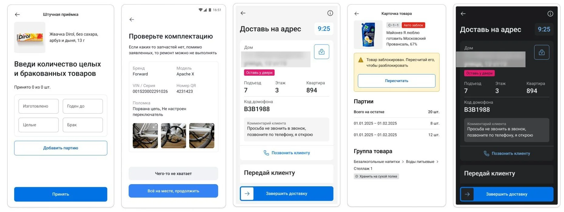
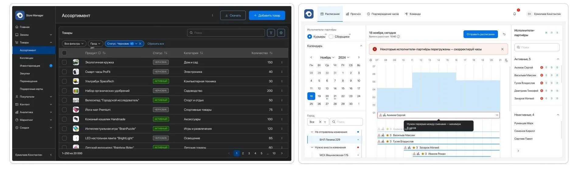
Article: read-only in a design system (in Russian) ↗ULCAMP’25 talk and Bang Bang Education workshop